
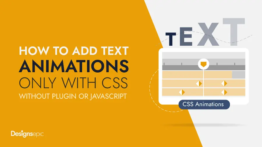
How to Insert Simple CSS Text Animations to a WordPress Site, Only CSS No JavaScript
One of my clients wanted me to add simple CSS text animations to important text and headings on to more emphasize the key point and get visitors’ attentions. However, the theme he was using was very basic and didn’t have this feature. Therefore, i started searching for some plugin that can animate paragraph and headings inside the default text editor.
I found some plugins, but some of them were too heavy because these plugins were using JavaScript-based animation, and others inserted their own text block or widget.
As i wanted to keep things simple and prefer to animate text inside the default theme editor. Further, it seems unnecessary to use a complete plugin to animate just a few lines of text. I came across a wonderful solution. I found that we can animate any text inside the default WordPress editor with just a few lines of CSS code, and it works with all themes
I thought it better to share this discovery with others and made this collection of all amazing text animations.
CSS Text Animations Previews
How to Use:
CSS Text Animations Previews
Download a single CSS file with all animations at the end of this article.
16 Simple CSS Text Animations With Code
Text Blast Effect
CSS Class: de-blast
<style>
.de-blast {
  display: inline-block;
  animation: explode 2s ease-in-out infinite;
}
@keyframes explode {
  0% { opacity: 0; transform: scale(0.5); letter-spacing: -0.1em; }
  30% { opacity: 1; transform: scale(1); letter-spacing: 0em; }
  70% { opacity: 1; transform: scale(1.2); letter-spacing: 0.1em; }
  100% { opacity: 0; transform: scale(2); letter-spacing: 0.3em; }
}
</style>
Zoom In Out Effect
CSS Class: de-zoom
<style>
.de-zoom {
  display: inline-block;
  animation: zoom 3s ease-in-out infinite;
}
@keyframes zoom {
  0%,100% { opacity: 0; transform: scale(0.8); }
  25%,75% { opacity: 1; transform: scale(1); }
}
</style>Text Expand Effect
CSS Class: de-expand
<style>
.de-expand {
  animation: spacing 3s ease-in-out infinite;
}
@keyframes spacing {
  0%,100% { letter-spacing: 0; opacity: 0.6; }
  50% { letter-spacing: 0.3em; opacity: 1; }
}
</style>Multi-Color Text Effect
CSS Class: de-multicolor-text
<style>
.de-multicolor-text {
  background: linear-gradient(90deg, #ff5f6d, #ffc371, #42e695);
  background-size: 200% 100%;
  -webkit-background-clip: text;
  color: transparent;
  animation: gradientMove 5s linear infinite;
}
@keyframes gradientMove {
  0% { background-position: 0% 50%; }
  100% { background-position: 100% 50%; }
}
</style>
Pop In Out Effect
CSS Class: de-poping
<style>
.de-poping {
  display: inline-block;
  animation: pop 2s ease-in-out infinite;
}
@keyframes pop {
  0%, 100% { transform: scale(0.8); opacity: 0.5; }
  50% { transform: scale(1.2); opacity: 1; }
}
</style>Left Slide Effect
CSS Class: de-left-slide
<style>
.de-left-Slide {
  display: inline-block;
  animation: slideLeft 3s ease-in-out infinite;
}
@keyframes slideLeft {
  0% { opacity: 0; transform: translateX(-100%); }
  30%,70% { opacity: 1; transform: translateX(0); }
  100% { opacity: 0; transform: translateX(100%); }
}
</style>
Bouncing Text Effect
CSS Class: de-bouncing-text
<style>
.de-bouncing-text {
  display: inline-block;
  animation: bounce 1.5s ease infinite;
}
@keyframes bounce {
  0%,100% { transform: translateY(0); }
  50% { transform: translateY(-20px); }
}
</style>
Wind Tilt Effect
CSS Class: de-wind-tilt
<style>
.de-wind {
  display: inline-block;
  animation: wind 4s ease-in-out infinite;
}
@keyframes wind {
  0% { opacity: 0; transform: translateX(-50px) skewX(20deg); }
  30%,70% { opacity: 1; transform: translateX(0) skewX(0deg); }
  100% { opacity: 0; transform: translateX(50px) skewX(-20deg); }
}
</style>Drop & Pop Effect
CSS Class: de-dropnpop
<style>
.de-dropnpop {
  display: inline-block;
  animation: drop 2s cubic-bezier(.28,.84,.42,1) infinite;
}
@keyframes drop {
  0% { transform: translateY(-80px); opacity: 0; }
  40% { transform: translateY(0); opacity: 1; }
  60% { transform: translateY(-15px); }
  80% { transform: translateY(0); }
  100% { transform: translateY(0); opacity: 0; }
}
</style>
Text Focus Effect
CSS Class: de-focusin
<style>
.de-focusin {
  animation: blur 3s ease-in-out infinite;
}
@keyframes blur {
  0% { filter: blur(8px); opacity: 0; }
  25%,75% { filter: blur(0); opacity: 1; }
  100% { filter: blur(8px); opacity: 0; }
}
</style>
Twist In Out Effect
CSS Class: de-twist
<style>
.de-twist {
  display: inline-block;
  animation: twist 2s ease-in-out infinite;
}
@keyframes twist {
  0% { opacity: 0; transform: rotateY(-90deg) scale(0.5); }
  40%,60% { opacity: 1; transform: rotateY(0) scale(1); }
  100% { opacity: 0; transform: rotateY(90deg) scale(0.5); }
}
</style>
Text Swing Effect
CSS Class: de-swing
<style>
.de-swing {
  display: inline-block;
  transform-origin: center;
  animation: rotateY 3s linear infinite;
}
@keyframes rotateY {
  0% { transform: rotateY(0deg); }
  100% { transform: rotateY(360deg); }
}
</style>
Color Flash Effect
CSS Class: de-color-flash
<style>
.de-color-flash {
  animation: flash 2s linear infinite;
}
@keyframes flash {
  0% { color: #ff5959; }
  25% { color: #ffb84d; }
  50% { color: #5ee7df; }
  75% { color: #9b5de5; }
  100% { color: #ff5959; }
}
</style>
Text Glow Effect
CSS Class: de-glow-Yellow
<style>
.de-glow-Yellow{
  color: orange;
  text-shadow:
    0 0 5px #ff4500,
    0 0 10px #ff8c00,
    0 0 20px #ffd700;
  animation: flame 2s ease-in-out infinite;
}
@keyframes flame {
  0%,100% { text-shadow: 0 0 5px #ff4500, 0 0 10px #ff8c00, 0 0 20px #ffd700; }
  50% { text-shadow: 0 0 20px #ff6347, 0 0 30px #ff8c00, 0 0 40px #ffd700; }
}
</style>
Light Flicker Effect
CSS Class: de-light-flicker
<style>
.de-light-flicker {
  color: #fff;
  text-shadow: 0 0 5px #00bfff, 0 0 10px #00bfff, 0 0 20px #00bfff;
  animation: lightning 2s infinite;
}
@keyframes lightning {
  0%,90%,100% { opacity: 1; }
  92% { opacity: 0.3; text-shadow: 0 0 20px #00bfff, 0 0 40px #00bfff; }
  94% { opacity: 1; text-shadow: 0 0 50px #00bfff, 0 0 80px #00bfff; }
  96% { opacity: 0.4; }
  98% { opacity: 1; }
}
</style>
Multi-Color Glow Effect
CSS Class: de-multiglow
<style>
.de-multiglow {
  animation: colorGlow 3s linear infinite;
}
@keyframes colorGlow {
  0% { color: #ff3c3c; text-shadow: 0 0 10px #ff3c3c, 0 0 20px #ff3c3c; }
  25% { color: #ffae00; text-shadow: 0 0 10px #ffae00, 0 0 20px #ffae00; }
  50% { color: #00e1ff; text-shadow: 0 0 10px #00e1ff, 0 0 20px #00e1ff; }
  75% { color: #a93cff; text-shadow: 0 0 10px #a93cff, 0 0 20px #a93cff; }
  100% { color: #ff3c3c; text-shadow: 0 0 10px #ff3c3c, 0 0 20px #ff3c3c; }
}
</style>
Text Glow Effect (Blue)
CSS Class: de-glow-blue
<style>
.de-glow-blue {
  color: #fff;
  text-shadow: 0 0 10px #0ff, 0 0 20px #0ff;
  animation: pulse 2s ease-in-out infinite;
}
@keyframes pulse {
  0%,100% { text-shadow: 0 0 10px #0ff; }
  50% { text-shadow: 0 0 20px #00ffff, 0 0 40px #0ff; }
}
</style>My Recommendation:
Text animation is a good way to get more attention from your website's visitors and help to emphasize particular text. If you need to add text animations to your WordPress site, I would recommend CSS animations because they are lightweight, easy to use, cross-browser compatible with all major browsers, and flexible. You can insert only the required block of code instead of using a bulky plugin.
Moreover, CSS code is comparatively easy to edit, and you can modify code snippets easily if there is need to do so.
You can download A Complete CSS file of 16 text animation effects, and paste CSS code into your theme's custom CSS area to make all animations available for the entire website.